Fonts for Code
I did never really bother about what fonts to use for programming. The default of the the IDE was fine for me. Then I came across this article of Coding Horror about a month ago. One sentence in the conclusion of it made me think:
Please don’t use the default Courier New typeface. Be kind to your eyes.
So I took a closer look on what ClearType really means. This wikipedia article and the Microsoft page about ClearType helped a lot. I had ClearType activated on my Windows XP a very long time but I never cared if a font is designed for ClearType or not. There is a tool from Microsoft (the ClearType Tuner in PowerToys) that allows to configure ClearType exactly for your display – it improved my screen a lot.
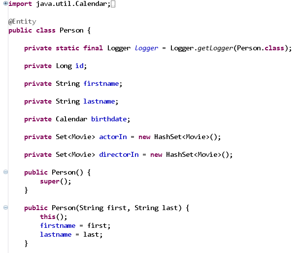
After knowing the “plus” of ClearType I downloaded and installed the special fonts pack from Microsoft. It changes the default font in Visual Studio 2005 do Consolas which is special ClearType font. As you can see in the screenshots below it looks really bad when used without ClearType activated:

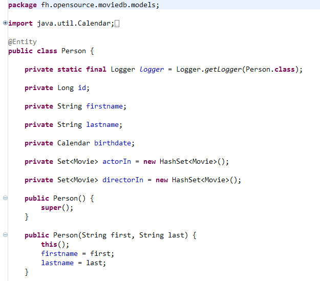
When ClearType is activated it looks like that:

I changed the font settings in my favorite IDE Eclipse to Consolas too and I am very happy with it. It is a subjective impression but I thinks it is better to my eyes 😉
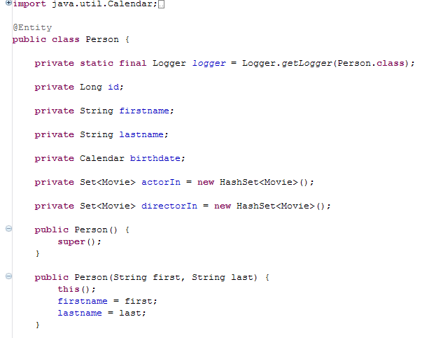
Compare it to Courier (which is the default font in Eclipse) with ClearType activated:

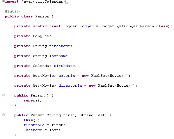
or Courier without ClearType:

There is a difference.
Fortunately there is a font called Inconsolata that is free and is very similar to Consolas which is perfect for programming under Linux.